New York University Abu Dhabi (NYUAD) lacks an efficient platform that facilitates seamless searching and booking of pet sitters, posing a significant challenge for both pet owners and pet sitters in the NYUAD community.
Goal
Design a pet sitting mobile app that connects pet owners with pet sitters on campus. The app aims to simplify the process of finding, booking, and managing pet sitting services, ensuring that pets receive the utmost care and attention while their owners are absent.
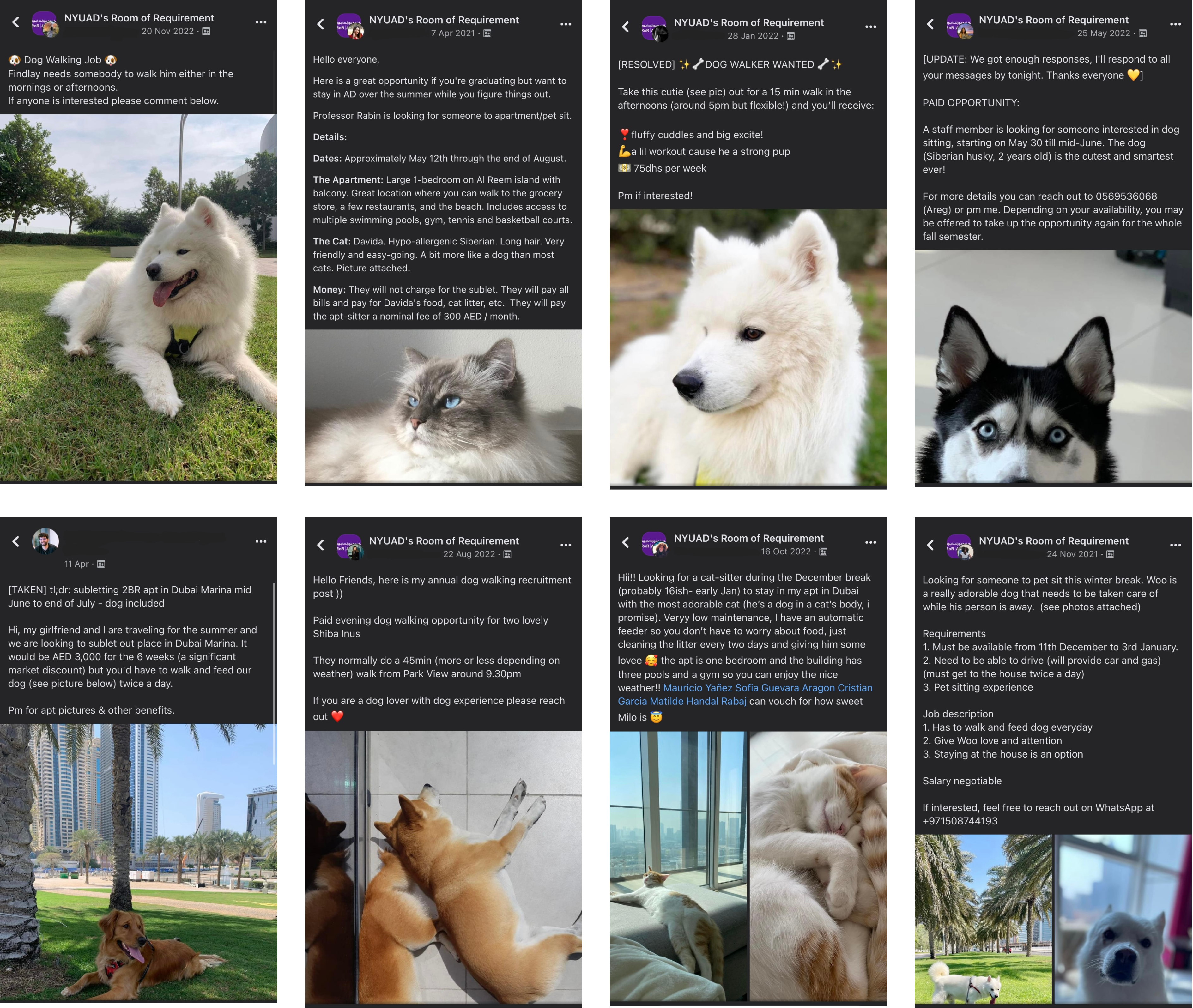
The inspiration for the pet sitting app project stemmed from a pressing issue within the NYU Abu Dhabi school community. Numerous posts on the school’s Facebook page revealed a recurring challenge: teaching and non-teaching staff struggled to find reliable student pet sitters, while students seeking pet sitting opportunities had difficulty connecting with staff in need. The absence of a dedicated platform for pet sitting services was clear, sparking the idea to design an app that could efficiently bridge this gap.
Understanding Pet Owners Concerns
User Interview
I conducted insightful interviews with 12 dog owners on our campus and within the city to ensure that my design truly met the needs and aspirations of the users.
Interview Goals:
Understand Needs and Concerns: Gain a deep understanding of the needs, concerns, and pain points of pet owners when it comes to finding and booking pet sitters. This insight will guide the development of features and functionalities that address their specific needs.
Identify Expectations: Determine what pet owners expect from a pet sitting app, such as communication features, trust-building measures, and updates during the sitting period. Knowing their expectations will help in creating a user-centric app.
Interview Questions:
• What are the main challenges you face when searching for a pet sitter?
• Can you tell us what factors you consider most when choosing a pet sitter for your pet?
• How do you prefer to communicate with the pet sitter while you’re away (e.g., phone calls, text messages, in-app messaging)?
• What features would you like to see in a pet sitting app that would improve your experience?
Key Responses:
Based on the interviews with dog owners, here is a summary of the needs, preferences, and user experience issues that were identified:
Takeaways
Most common needs discovered through the interviews:
• I uncovered that trust and reliability were key concerns for dog owners seeking pet sitters.
• Desire for timely updates and photos during sitting periods to feel assured that their beloved pets were in caring hands.
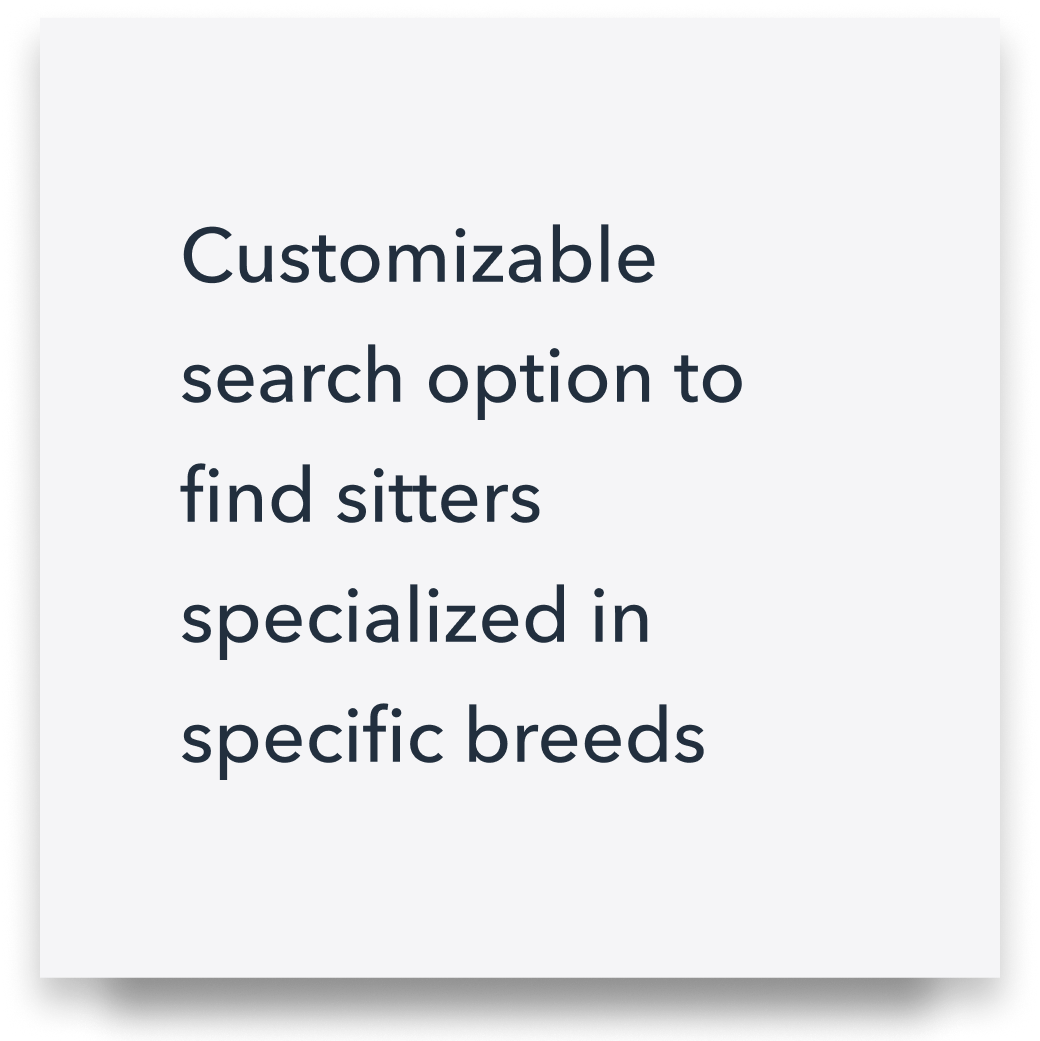
• To find sitters specialized in specific breeds or catering to individual care requirements, such as administering medication.
Possible Solutions
• Incorporate features like verified reviews, background checks, and references into the app to build a trustworthy community.
• Integrate in-app messaging and photo-sharing functionalities to enable seamless communication between pet owners and sitters.
• Create a customizable search option within the app to enable dog owners to find sitters specialized in specific breeds or catering to individual care requirements.
• Design an effortless booking process, where dog owners can now easily discover available sitters, review their profiles, and book the most suitable sitter.
• Add a calendar system for streamlined booking management and availability tracking.
User Surveys
I conducted a survey with 14 pet owners, who were between the ages of 18 and 65. I collected responses in the form of multiple choice and short answers. The questions covered major topics such as the need for a mobile app, how they typically find pet sitters? (e.g., recommendations, online platforms, pet care services), how often they require pet sitting services, are they open to considering pet sitters from areas outside of their location if they meet their requirements?, etc.
Define
Persona
I created a persona to have a clear picture of the needs, frustrations, and characteristics of the users I am designing for. User personas serve as a reference point throughout the design and development process.
Problem Statement
A problem statement is a clear description of the user’s needs and serves as a guiding statement for the design process. It is now easy to “who, what, when, where, why, and how” of solving the problem, all guided by a well-defined persona.
User Journey Map
The user journey map below is a visualization of the steps and emotions that a user goes through in the process of a searching and booking a dog walker. It helps me as a designer to better understand user actions, decisions, and emotions while interacting with the app to help me address their concerns effectively, making it easier for them to find reliable pet sitters with confidence.
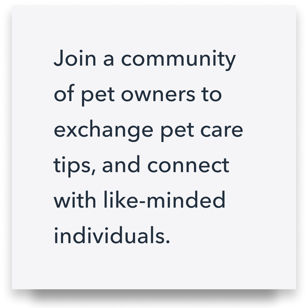
Build Value Propositions
Users don’t know our product or understand its value yet. That’s where value propositions come in. Value proposition is the unique value and benefits our product provides to its target audience that sets it apart from other similar offerings. It highlights the reasons why customers should choose our product over others.
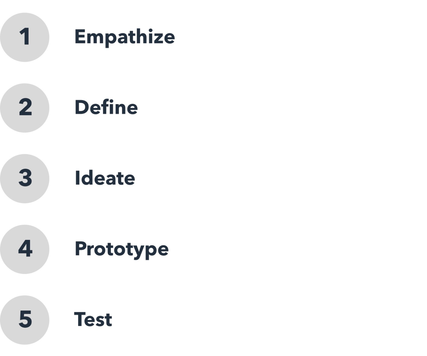
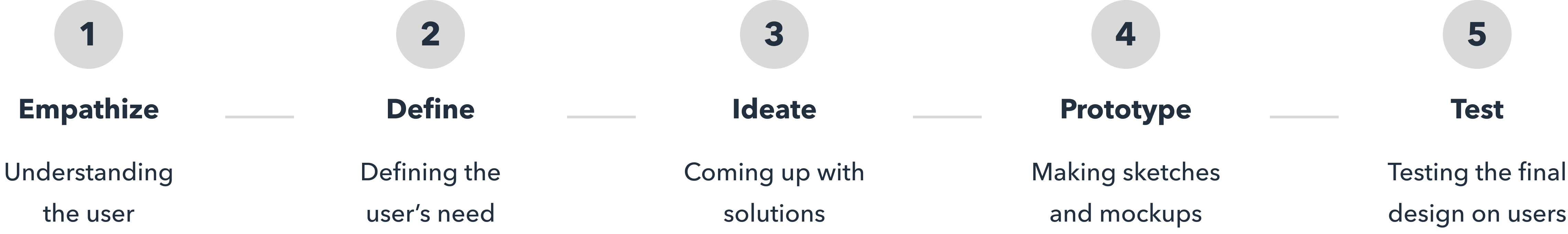
Ideate
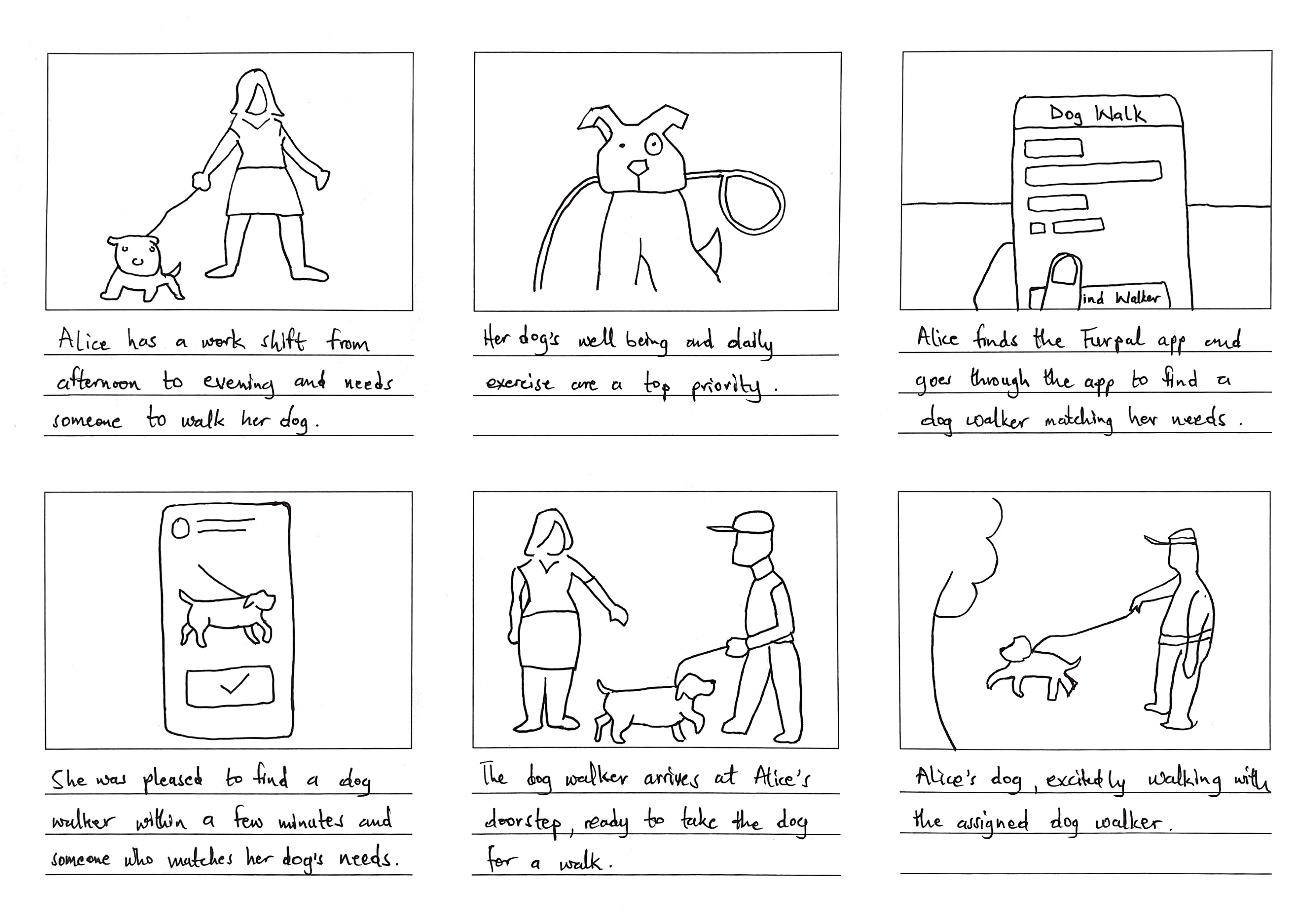
Storyboard
A storyboard for the pet sitting app is a visual representation of the app’s user flow and key interactions. It uses a series of illustrations or sketches to depict the user’s journey from the moment they open the app to accomplish their goal of finding a reliable and trustworthy pet sitter for their beloved pet.
Information Architecture/Sitemap
Information architecture in the design stage of the pet sitting app refers to the process of organizing, structuring, and categorizing the app’s content in a way to make it simple and intuitive to navigate.
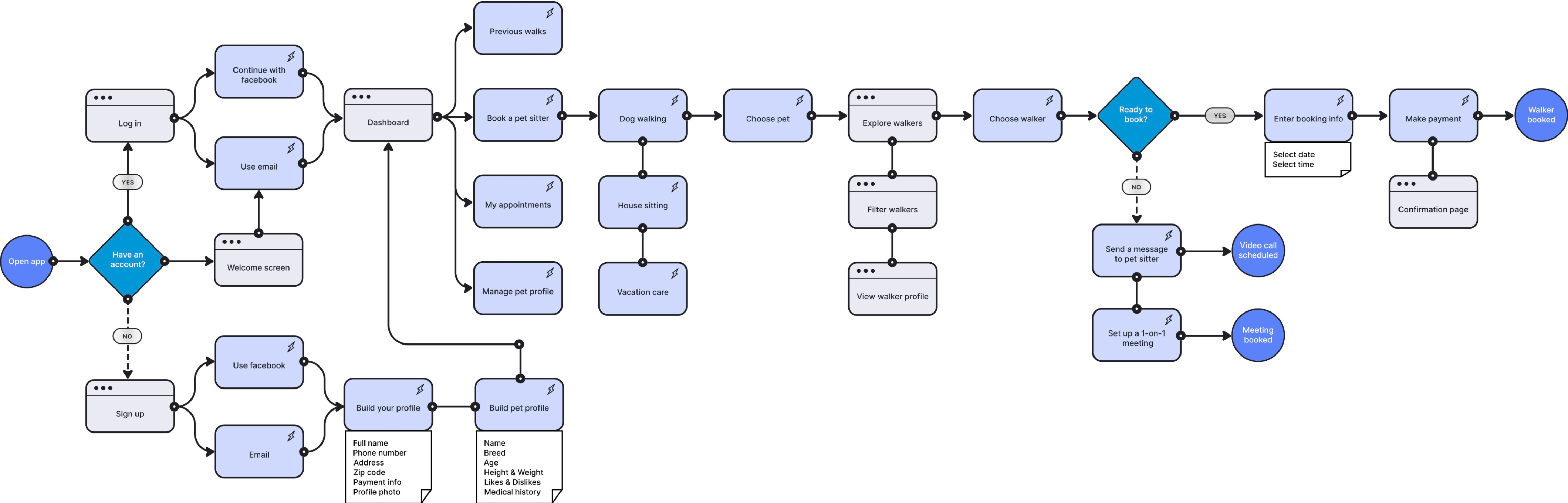
User Flow Diagram
Creating a user flow diagram involves mapping out the entire journey a user will follow, from the moment they open the app to the completion of their intended action, such as finding a pet sitter and booking their services.
Prototype
Paper Wireframe
A paper wireframe is a low-fidelity, sketched representation of the app’s user interface and layout. It serves as a basic visual blueprint of the app’s design, allowing to quickly iterate and explore different layout options.
Digital Wireframe
As the next thing after the paper wireframes, digital wireframes offer a more refined and detailed depiction of the app’s design, including precise elements, interactions, and visual hierarchy.
Low-Fidelity Digital Wireframe
Low-fidelity wireframes are intentionally kept simple and devoid of elaborate design elements, such as colors, images, or detailed typography. They focus on the layout and positioning of essential user interface (UI) components.
High-fidelity wireframe is a realistic representation of the look and feel of the final product. It includes visual elements such as images, icons, and typography; and interactive elements such as clickable buttons, dropdown menus, and input fields, allowing users to experience a more realistic interaction with the app.
The selection of colors was a critical aspect for me, as it deeply influences user perceptions and emotions. I chose blue as the primary color because it is often associated with trust, calmness, and reliability. These emotional qualities are essential in a pet sitting app, where users are entrusting their beloved pets to the care of others. For the sake of accessibility, I made sure both light and dark themes of the various colors pass the WCAG accessibility contrast ratio.
Typography
With so many typefaces available, I decided to choose “Avenir Next,” a sans-serif typeface developed by Adrian Frutiger in collaboration with Akira Kobayashi. I chose Avenir Next as the primary typeface because of its legibility and rounded letterforms, which provide a sense of readability and approachability. It is also a typeface that passes the I-L-1 test for data tables and information seen at-a-glance. It was very important to me that I choose a typeface with distinct characters that can help users to easily differentiate alphanumeric data.
Sticker Sheet
I created a sticker sheet that contains all the symbols, icons, buttons, UI elements, and other graphical assets used in the app. This serves as a valuable point of reference, ensuring a steadfast consistency in style and design language. Consistency creates a sense of trust and reliability, which can lead to increased engagement and brand loyalty among users.
Mockups
Mockups provide a visual representation of the final design, allowing designers, stakeholders, and clients to see how the product will look and function. It can be used in usability testing to identify usability issues and provide insights for improvements before the actual development phase begins.
Usability Test
Usability Study
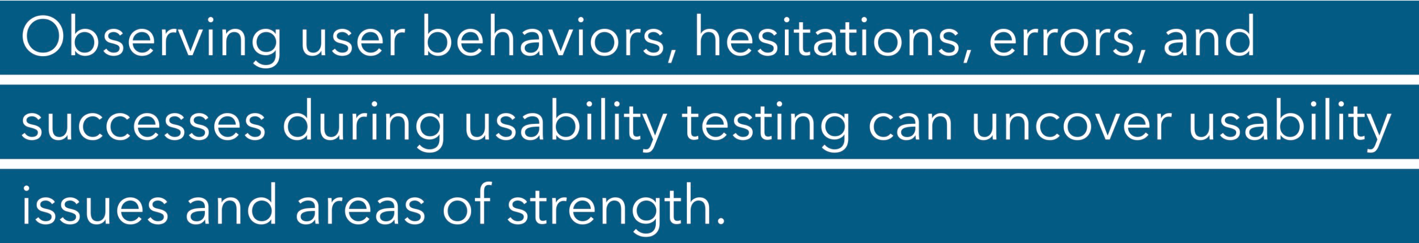
A usability study, also known as usability testing or user testing, is a research method I conducted to observe how potential users interact with the final design to complete specific tasks. The primary goal of a usability study is to identify usability issues, gather feedback, and improve the user experience.
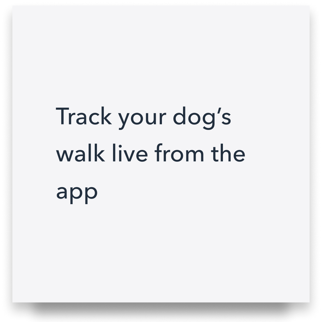
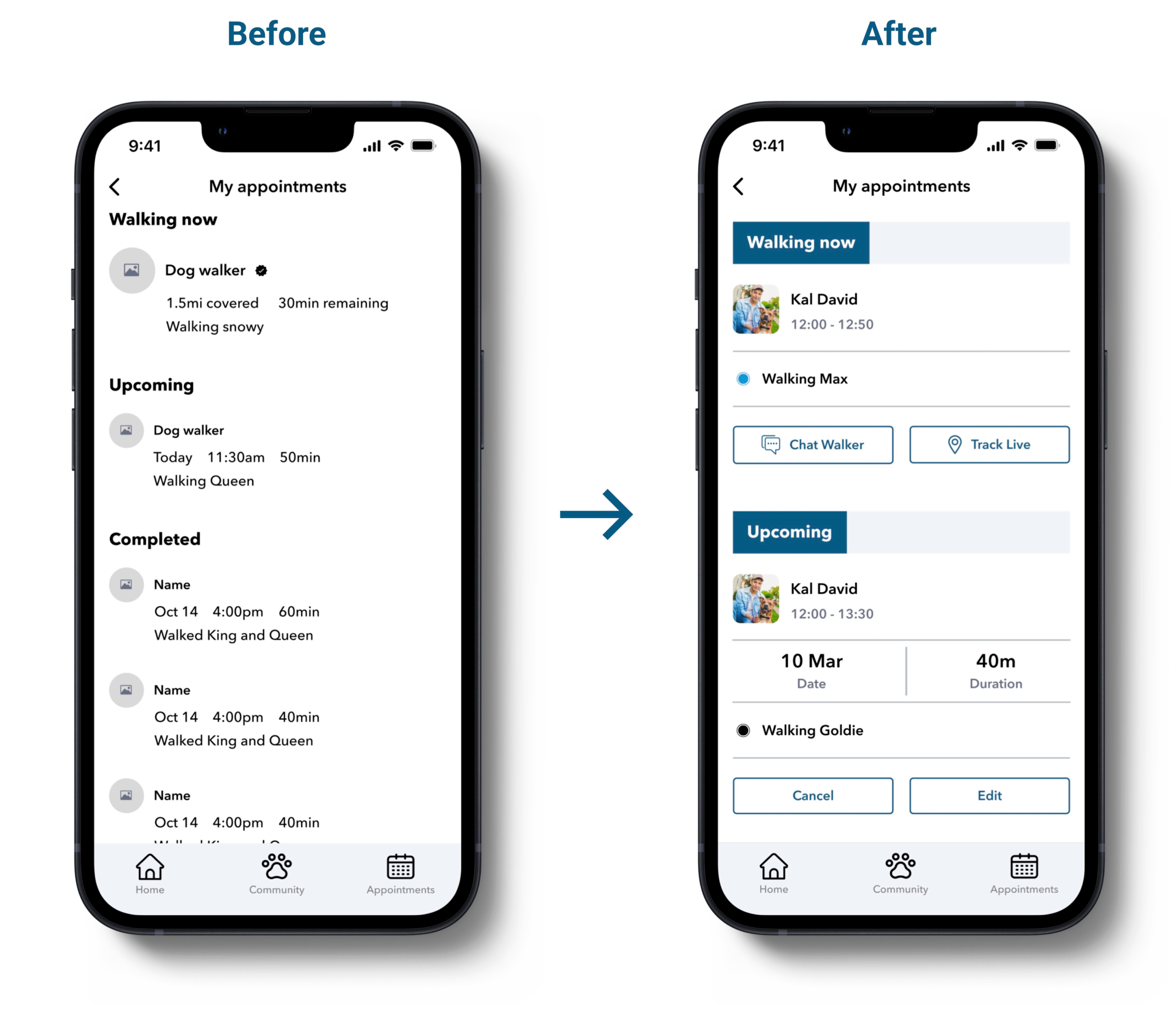
One of the usability issues that arose was the users’ desire to have the capability to engage in live chat with walkers and track their dogs in real-time during their walks.
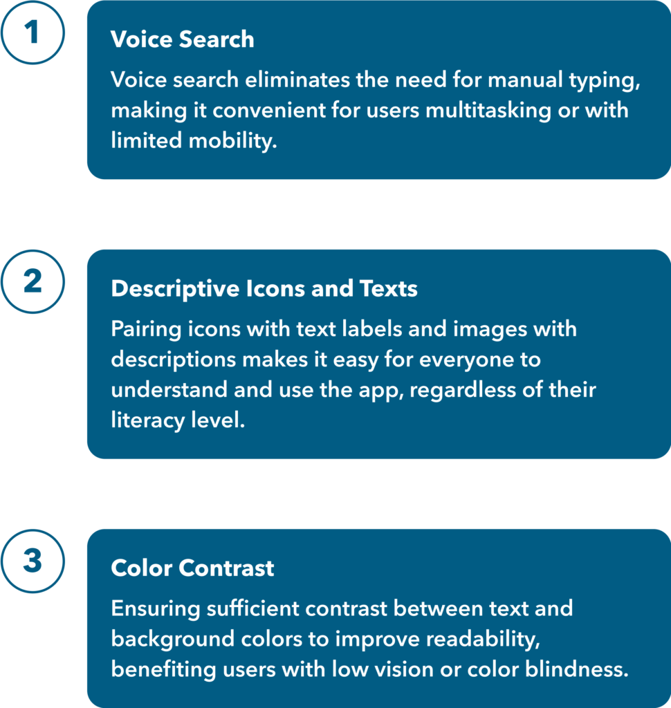
Accessibility Considerations
As a designer, it’s my responsibility to ensure that my designs are universally usable, regardless of a user’s situation, abilities, or context. Accessibility allows users of all abilities to understand, use and enjoy the app.
Going Forward
Takeaways
One of the most significant insights gained from this project was the strategic use of user research and competitive analysis to craft a product that stands out in the market. In product design, the focus isn’t solely on aesthetics but on providing effective solutions to real problems.
Next Steps
The immediate next step involves conducting additional user research and usability tests to further refine the app, ensuring it consistently delivers a seamless and rewarding experience that aligns with user needs and expectations.